The fictional company Börsen-Crash AG wants to present its sales figures from recent years to its shareholders. Management knows that investors react sensitively to negative signals. Mr Frech-Lügegern and Dr Balkenbieg are therefore asked to visualise the figures as favourably as possible.
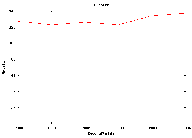
Revenue rises in the last two years, but there were declines in 2001 and 2003. Sales figures alone also say nothing about profit: the particularly high revenue in 2005 could, for example, have resulted from the sale of property or patents.
| Year | Revenue in millions of euros |
|---|---|
| 2000 | 127.00 |
| 2001 | 123.40 |
| 2002 | 126.90 |
| 2003 | 123.23 |
| 2004 | 134.08 |
| 2005 | 137.79 |
The same data, different impressions
The first version shows the development with a y-axis starting at zero:
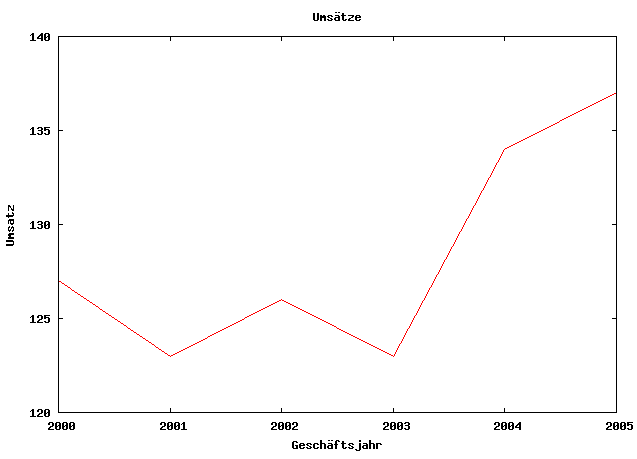
If the y-axis does not start at zero, the same fluctuations appear much more dramatic:
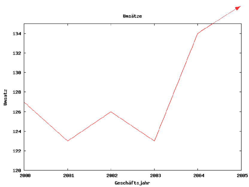
The aspect ratio of a chart also influences the impression. A narrow, tall display makes the rise appear steeper:
Aggregation can hide fluctuations
If two years at a time are combined, the temporary declines disappear:
| Years | Revenue in millions of euros |
|---|---|
| 2000–2001 | 250.40 |
| 2002–2003 | 250.13 |
| 2004–2005 | 271.87 |
The numbers are arithmetically correct. The presentation becomes misleading through selection, scaling, aspect ratio and aggregation. A chart should therefore never be judged without axis labels, scale, reference period and context.